Icon of Robert Jackson Harrington

Hi! Thanks for stopping by.

This portfolio gives a quick overview of the work I’ve created while at The University of Texas at Austin.

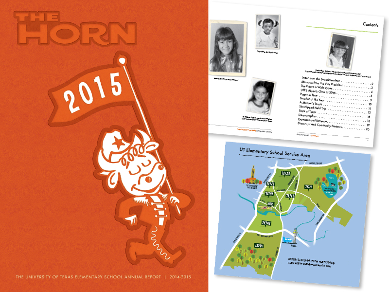
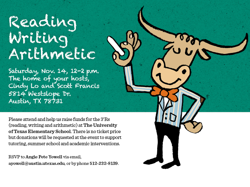
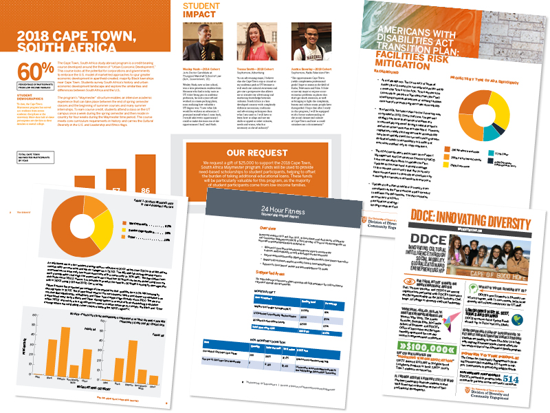
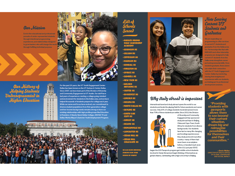
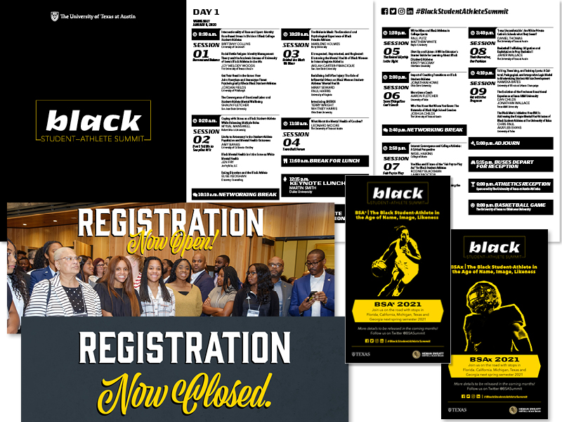
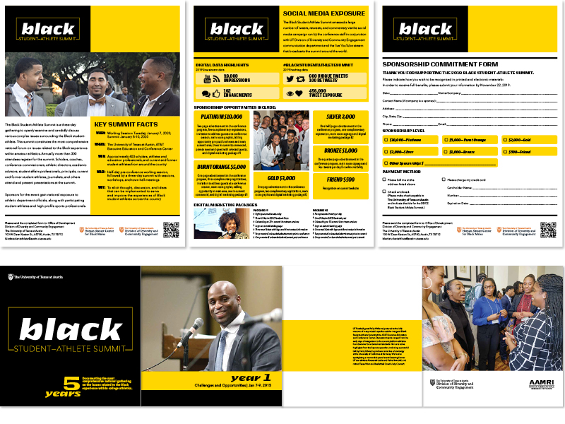
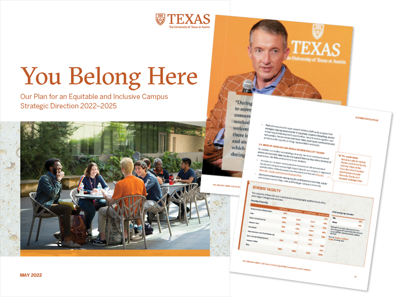
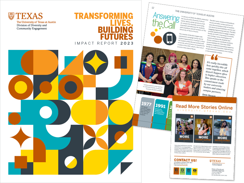
My primary responsibilities include the design and production of web and print media that adheres to the university’s brand identity, including annual reports, brochures, flyers, postcards, t-shirts, event programs, event display signage, ads, presentations and webpages.
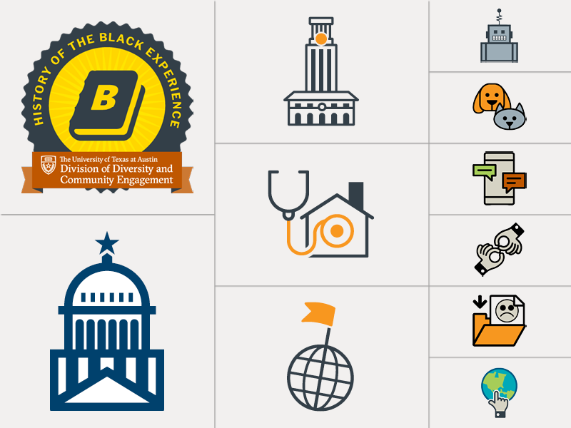
LAYOUT

The foundation of my skill set as a graphic designer lies with my strong sense of layout and composition. My sense of color, space, image choice, font pairings and ability to create appealing designs enhances the content that in turn, delivers engaging messaging.
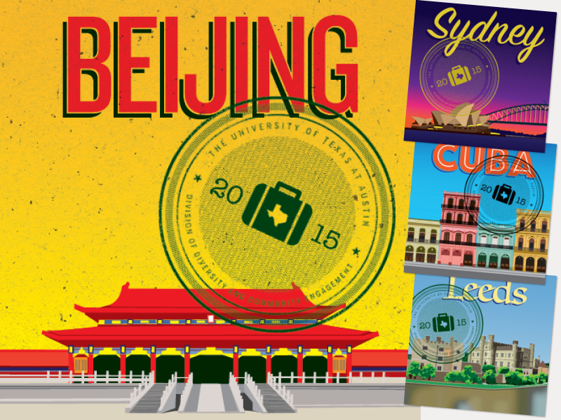
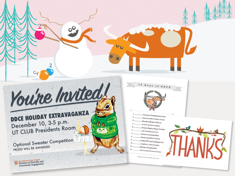
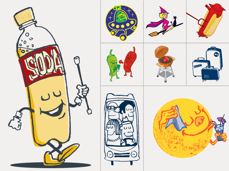
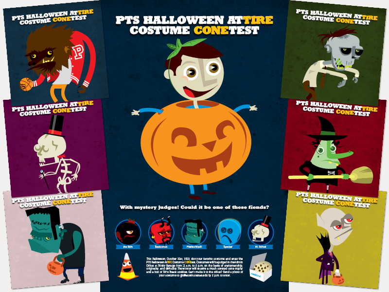
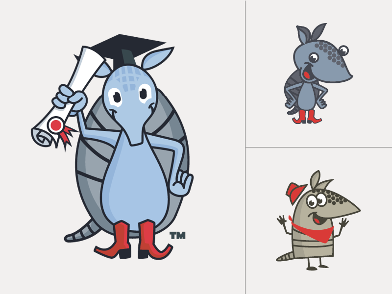
I’ve designed and created illustrations for all 9 issues of Access, DDCE’s bi-annual print and online magazine.
These recent examples from Access issue 9 highlight my layout, typography and illustration skills.
I’ve generated reports and informative handouts for the development team in various styles tailored to their specific audiences. These examples “brand up” and adhere to the university’s visual identity.
This brochure for the Youth Engagement Center-Dallas serves the dual-purpose of recruiting underserved students from the Dallas area, while simultaneously working as a developmental tool for generating support for the program.
From conference programs, to web graphics, to social media images, to directional signage and more, the Black Student-Athlete (BSA) summit offers a quick overview of my skill-set that encompass a wide variety of deliverables.
These deliverables include not only media for the actual event, but visual support leading up to the summit and beyond, such as a sponsorship deck for developmental needs and a commemorative photo gift book for the BSA planning team, support staff, and past VIP attendees.
A 31-page 3-year strategic plan from the Office of the Vice President meant as a suppliment to the president’s 10-year strategic plan.
The 2023 Impact Report for the Office of the Vice President illustrates the impact of the DDCE’s many programs, centers and units that are supporting all Longhorns and serving communities here in Austin and across the globe.
While not all inclusive, various examples of social media graphics for use to promote various campaigs over the course of the last three years for The University of Texas at Austin.

ILLUSTRATION

Paired with my fundamental knowledge of graphic design, my illustration expertise boosts my ability to create unique media with limited resources.
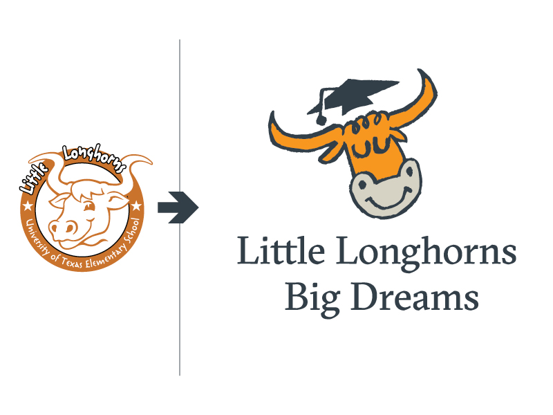
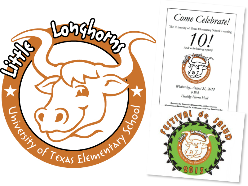
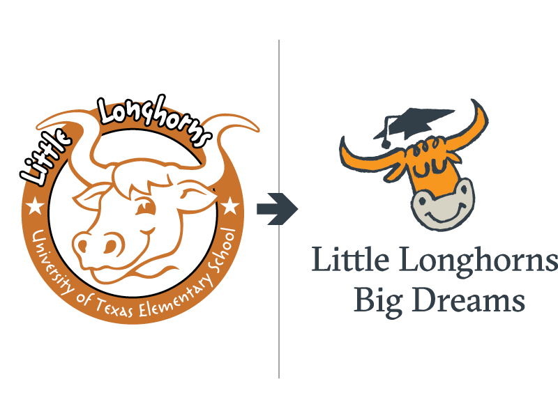
Drawing has always been a tool at my disposal. I’ve drawn since my childhood and is a skill that is highly refined and extremely useful in my current role. These graphics were geared to promote DDCE study abroad programs on social media.
I’m skilled in both traditional and digital illustration, using tools like Illustrator as confidently as pencil and paper. This graphic served as the cover illustration for the Division of Diversity and Community Engagement magazine Access.
This illustration showcases how I use visual storytelling to create engaging, idealized imagery. With the Chase building under renovation and existing photos showing disrepair, I illustrated it in an “idealized architectural style” to support promotion and fundraising efforts.
My favorite style of illustration is obviously cartoon. I think it reflects my fun and outgoing personality. This style lends itself to fun and engaging promotions, while building office morale, especially when used for internal communications.
Here are more examples of illustrations in my favorite style used to support content for various media.
Using illustration helps open up infinite possibilities when searching for visual solutions and a good picture can’t be found. To encourage participation in the annual Halloween costume contest at PTS, I illustrated and designed 11 different posters featuring various monsters and ghouls usually associated with the holiday.
I was tasked with creating an armadillo character for an external partnership with the Texas Higher Education Coordinating Board. The project, Ask ADVI, is an artificial-intelligent chat-bot geared toward informing Texans about any higher education questions they may have.
Paired with a graphic design sensibility, my drawing skills help create visually appealing yet understandable iconography.

BRAND

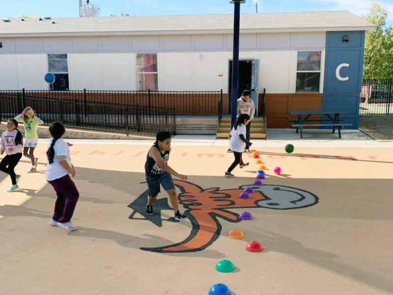
Here’s a quick case study of updating an outdated design for the University of Texas Elementary School by leveraging the university’s visual identity. The new identity adheres to the university’s brand guidelines while giving it a unique feel appropriate for their audience.

This case study showcases the evolution of UT Elementary School’s visual identity during my time at DDCE. I led a redesign, from playful illustration to cohesive branding, that addressed outdated visuals and resonated with both the school’s young audience and the broader UT community.
These were the assets I inherited for the University of Texas Elementary School upon beginning my tenure at DDCE. Outdated, novice and visual unappealing, I set forth on updating their visual brand.
One of the first projects I completed was to create an annual report with a yearbook theme requested by development at UTES. I omitted the word mark and referred to an old UT yearbook for inspiration. Additionally, I provided the unique illustration pictured on the cover and throughout the report.
The unique longhorn from the annual report evolved into a simpler character which still maintained its visual appeal, all while targeting UTES fun, youthful audience.
Soon the new character became a familiar image and built a strong visual association with the school. Overtime it was incorporated into everything from flyers, to presentations and promotional items such as T-shirts and tote-bags.
Finally, by 2017 I was tasked with an overhaul of their word mark. It was easy to update the longhorn character to look more childlike and then incorporate that image into a visual identity that matched the university’s brand.
Although UTES carries an official shield word mark from UT Communications and uses that on official reports and other documents, the “spirit logo” works as an alternative for other applications that includes staff polos and other fun promotional opportunities.
Easily the most satisfying aspect of the work I’ve done for UTES on behalf of DDCE, is the kind words of thanks and appreciation from their administration and staff for providing them with a professional visual identity that appeals to the kids at their school.